My Kitchen: 3D Planner
- 4.4
- Rating
- 1.00M
- Installs
- Free
- Price

 Analysis by App-foxy
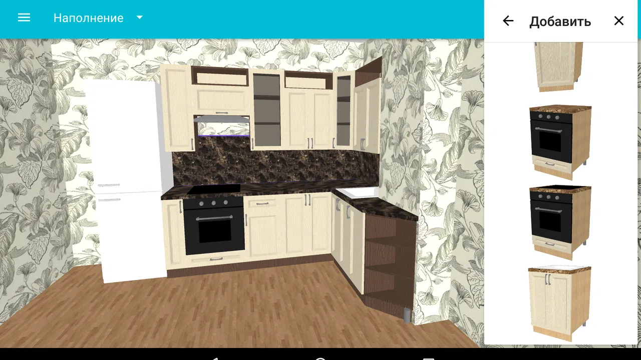
Planning a kitchen on a phone sounds like the sort of task that should require graph paper, a tape measure, and a fair amount of patience. My Kitchen: 3D Planner takes a more visual route: it gives me a way to think through a kitchen arrangement before committing to real furniture, appliances, or renovation work. I found its main value in turning vague ideas into something I could inspect from different angles, rather than leaving everything as a list of cabinet widths and imagined clearances.
This is a free House & Home app from Ovchinnikov Andrey, aimed at anyone who wants to explore a kitchen design on a mobile device. It is suitable for Everyone, runs on Android 7.0 and later, and has reached more than a million installs. The current version is 1.33.0, while optional in-app purchases range from $0.99 to $9.99 per item. Those details matter because this is easy to try without an upfront payment, but the full experience may not remain entirely free if you want everything the app offers.
How the planner feels when the connection is part of the experience
The first thing I would tell a friend is that this is a visual planning tool, not a replacement for a kitchen designer or a contractor. Its job is to help me test an arrangement and notice problems early. A three-dimensional view can reveal an awkward corner, an overly crowded work area, or an appliance placement that looked acceptable in a flat sketch but feels wrong once the room is viewed as a whole.
You May Also Like

 Blood Strike: 2.5 Anniversary
Blood Strike’s Loadouts Turn Every Drop Into a Tactical Gamble
A close look at Blood Strike’s custom loadouts: how fast access to signature weapons reshapes its battle royale rhythm, rewards preparation, and narrows the gap between fights.

 Pandora - Music & Podcasts
Pandora’s Music Is Easy to Start, but Harder to Recover
Pandora’s strength is its low-effort path from a seed to a station. Its weak spot is how much confidence it asks you to place in connection, setup, and quiet recovery.

 8 Ball Pool
 Is Built on Rivalries, Rematches, and Routine
A close look at the rivalries, rematches, shared routines, and unanswered safety questions that turn a quick pool match into a persistent mobile community.

 Samsung Music
’s Quiet Strength Is Playing What You Already Own
Its reach comes less from spectacle than from dependable access to a personal library. That simplicity is both the app’s strongest retention engine and its ceiling.

 AccuWeather: Weather Radar
AccuWeather Review: A Quick, Clear Forecast for Everyday Decisions
For everyday plans, the best forecast is the one you can understand quickly. AccuWeather makes rain timing, radar, and local conditions easy to act on, with a few trade-offs.

 Hill Climb Racing
Why Hill Climb Racing Still Turns Crashes Into One More Run
A tiny car, a bumpy hill and one more upgrade: Hill Climb Racing keeps resurfacing because its simple chaos makes every near-miss feel personal.
More From Our News Desk
View All News


That distinction keeps expectations realistic. I would use the app to compare ideas, discuss a layout with someone at home, and prepare more useful questions for a professional. I would not treat a screen design as proof that a real kitchen will fit. Walls, doors, windows, plumbing, ventilation, electrical points, ceiling height, and manufacturer clearances still need proper checking.
The network becomes relevant whenever the app needs to load something beyond the basic act of looking at a design. Depending on the phone, connection quality, and what the app is doing at the time, a slow network can make browsing or loading feel less immediate. I avoid making important layout decisions while waiting for content to appear, because a delayed visual response can make the process feel more frustrating than it needs to be.
My practical approach is to open the project before I need to show it to somebody. If I am visiting a showroom or speaking with a tradesperson, I do not want the first attempt to load the design to happen in a weak signal area. A quick check at home also gives me time to close other demanding apps and make sure the phone has enough battery for moving around a three-dimensional plan.
There is a useful difference between network friction and design friction. If the app responds slowly, that may be a connection or device issue. If a layout feels difficult to adjust, that is a usability issue. Separating those two helps me judge the planner fairly instead of blaming the design tools for a temporary loading problem.
Why three-dimensional planning is more useful than a quick sketch
A hand-drawn plan is still excellent for recording rough measurements, but it does not always communicate how a kitchen will feel from standing height. The 3D approach is better for conversations. Someone who cannot interpret a floor plan can usually understand a visual scene quickly, which makes it easier to compare an L-shaped arrangement with a straighter, more open alternative.
I especially like the idea of using the app before shopping. Rather than choosing cabinets one by one and hoping they work together, I can first think about the relationship between storage, preparation space, cooking, and movement. That change in order is important: the app is most helpful when it supports decisions, not when it is used only to decorate an already settled plan.
There is also a psychological advantage. Renovation decisions can feel expensive because every choice seems permanent. A digital layout gives me permission to experiment. I can consider a bold arrangement, then remove it without wasting materials. That makes the early planning stage less intimidating and often exposes assumptions I would otherwise carry into a real purchase.
Using it on a small phone, at home, or while shopping
Although a kitchen is a large physical space, the app is designed for a small screen. On a phone, I find it better for short sessions than for an hour-long design marathon. Touch controls demand concentration, and a crowded scene can become harder to understand when the display is compact. I get more from it when I make one decision at a time: first the overall arrangement, then the work zones, then the visual details.
A tablet-sized screen would naturally make a room easier to inspect, but I would still begin with the phone because it is the device most likely to be available when an idea occurs. A quick session while visiting a furniture store can help me remember which configuration I wanted to test later. I would not rely on hurried editing beside a busy showroom aisle, though. That environment is good for collecting ideas, not for precise planning.
A realistic everyday use case is a weekend discussion with a partner or housemate. One person may prefer more open floor space, while the other wants additional storage. Instead of arguing from memory, I can show two arrangements and discuss the trade-off directly. The app becomes a shared visual reference, which is more productive than pointing at separate inspiration images that do not match the actual room.
Another useful situation is preparing for a conversation with a contractor. I can bring a rough concept and explain what I was trying to achieve: more preparation room, a clearer route through the kitchen, or a better relationship between storage and appliances. The design does not need to be technically final to be valuable. It gives the conversation a starting point and helps me ask better questions.
I would be careful with exact measurements. A phone screen can make two spaces look similar even when their real dimensions differ significantly. I use the planner to compare relationships and identify likely conflicts, then verify the physical room separately. That is one of the most important trade-offs: the app improves visual thinking, but it cannot remove the need for accurate measuring.
What happens when loading or editing does not go smoothly
Any mobile design workflow has weak points. A project that takes time to appear, a view that needs to be reopened, or a control that does not behave as expected can interrupt concentration. I reduce that risk by saving a simple written record of the ideas I am testing. It can be as basic as “more drawers near preparation area” or “compare open corner with tall storage.” If I have to restart, I know what the previous session was trying to solve.
I also prefer making changes in small groups. If I alter the entire room at once and the result looks wrong, I may not know which decision caused the problem. A slower sequence is easier to recover from: establish the general shape, inspect it, add the major elements, inspect again, and only then spend time on appearance. This is not glamorous, but it makes the app more useful as a planning instrument.
Connectivity can affect recovery as well. When a connection is unstable, repeatedly tapping the same control is rarely helpful. I wait, return to the previous view if possible, and reopen the project rather than creating a chain of uncertain actions. Before an important presentation, I make sure I have already viewed the design successfully. That small habit prevents the app from becoming the weakest part of an otherwise useful discussion.
I would not use a single digital design as the only record of a renovation decision. Keep the room measurements, appliance dimensions, and notes somewhere separate. This protects the work from a phone problem and makes the information easier to share with someone who is not using the app. The planner is strongest as a visual layer over those practical notes.
There is another limitation worth mentioning: visual confidence can become misleading. A polished-looking scene may feel finished even when the underlying plan still needs checking. I deliberately ask myself questions the image cannot answer: Can the doors open together? Is there enough clearance to work comfortably? Where will services enter? Does the proposed storage make everyday items easy to reach? The more attractive the design becomes, the more important those questions are.
Keeping mobile use sensible when data matters
I treat the app as something to use deliberately rather than leave open all day. When I am experimenting, I prefer a stable home connection, especially if the design needs to load visual content. On mobile data, I limit sessions to the decisions that actually need attention. This is useful not only for data-conscious users but also for anyone working in a place where the signal changes from room to room.
I do not assume that a design will behave exactly the same in every network condition. A strong connection makes it easier to distinguish the app’s normal controls from temporary delays. If I am evaluating the experience for the first time, I test it in the environment where I expect to use it most: at home, on the phone I normally carry, and with the kind of connection available there.
Battery use is part of the same practical picture. Three-dimensional scenes can encourage longer sessions because it is tempting to keep adjusting details. I plan shorter design blocks and charge the phone before a serious comparison. That sounds obvious, but it matters when the app is being used during a renovation visit or while several people are waiting for a decision.
For privacy-conscious users, I would review the app’s current permission and store information before installation and again after updates. I do not invent assumptions about how a particular version handles data. The sensible habit is to understand what the phone asks for, keep the app updated through the normal store process, and avoid entering information that is unnecessary for a kitchen concept.
Optional purchases deserve a little attention too. The app is free to start, but the presence of items priced from $0.99 to $9.99 means I would check what is included before building a plan around a particular element or workflow. I prefer to explore the free experience first, then decide whether a paid addition genuinely improves the project. That prevents a small experiment from turning into an unexpected series of purchases.
Where it fits among the usual kitchen-planning alternatives
Compared with paper, this app is more flexible for showing depth and comparing alternatives. Paper remains faster for scribbling measurements and marking doors, windows, and service points. I use both rather than choosing one. The paper captures facts from the room; the app helps me imagine how those facts might become a kitchen.
Compared with a general drawing app, the dedicated kitchen focus is the main advantage. A blank canvas gives freedom, but it also makes me responsible for representing every object consistently. A kitchen planner gives the task a clearer frame, so I can spend more time thinking about the arrangement and less time drawing symbols. The trade-off is that a specialized tool may feel less suitable for unusual architectural situations or highly customized furniture.
Compared with professional design software, this is the approachable option. I would choose it for early exploration, a household discussion, or a first conversation with a supplier. A professional system is the better choice when the project requires detailed construction information, technical documentation, or a precise specification for installation. The two tools serve different points in the process, and expecting this mobile app to replace professional documentation would be unfair.
Its rating of 4.3 from around 4.6 thousand ratings suggests that many people find the concept worthwhile, while the smaller review count of 163 means I would still judge it on my own phone and project rather than treating the score as a guarantee. The app has been available since August 14, 2018, and its continued presence alongside more than a million installs gives it a useful level of familiarity, but popularity does not solve the measurement and connectivity issues that come with mobile planning.
Who should try it, and who should choose something else
I recommend it to renters imagining a future home, homeowners comparing renovation ideas, couples trying to agree on a layout, and anyone who thinks better when they can see a room rather than read a specification. It is also a good first step for people who feel overwhelmed by kitchen planning. Starting with a visual concept can make the next conversation more focused and less abstract.
I would be more cautious about recommending it to someone who needs a final technical plan immediately. If the project depends on exact cabinetry production, detailed service drawings, or professional compliance checks, use a qualified designer or a more technical tool after the initial concept stage. I would also skip it as the main solution if I wanted a broad interior-design system covering an entire home rather than a kitchen-focused planning experience.
People with older Android phones should note the minimum requirement of Android 7.0. That is not a demanding threshold for many devices, but compatibility is still worth checking before spending time preparing a project. iOS users should confirm the version available for their device through the relevant store, since the Android requirements do not automatically describe another platform.
The best workflow I found is simple: measure the room separately, sketch the fixed features on paper, create a rough digital arrangement, compare two or three alternatives, and then take the strongest idea to a professional for verification. Keep network-dependent tasks for a reliable connection, and do not make a purchase merely because an item looks right in the scene. The app is most valuable before commitment, when changing your mind is still cheap.
My connectivity verdict
My Kitchen: 3D Planner works best when I treat it as a visual conversation tool with practical limits. A dependable connection makes the experience easier to start, inspect, and share, while a poor connection can turn a quick comparison into a stop-and-start session. I therefore prepare designs before appointments, keep separate notes, and avoid relying on the app as the only copy of important information.
The free entry point makes it easy to test whether this style of planning suits me, and the Everyone rating keeps it approachable for ordinary household use. The paid items mean I would explore first and spend later. I also appreciate that the app can make a difficult family decision more concrete without pretending to be the final authority on construction.
In my view, this is a sensible choice for early kitchen planning, especially if I want to see how different arrangements might feel and explain those ideas to someone else. It is not the right tool for replacing measurements, installation expertise, or technical drawings. Used with those safeguards, My Kitchen: 3D Planner earns its place as a practical first draft: convenient, visual, and most effective when a stable connection supports the creative process rather than distracting from it.
FAQs for My Kitchen: 3D Planner
01What is My Kitchen: 3D Planner and how does it work?
My Kitchen: 3D Planner is a virtual design tool that allows users to create detailed kitchen layouts in a 3D environment. With an intuitive interface, you can choose from a variety of cabinets, appliances, and finishes to visualize your dream kitchen. The app offers drag-and-drop functionality and customization options to fit any style or space constraints.
02Is My Kitchen: 3D Planner free to use?
My Kitchen: 3D Planner offers a free version with basic features, allowing users to create and save simple designs. However, to access advanced tools, premium design elements, and remove ads, users may need to purchase a subscription or make in-app purchases. Check the app store for specific pricing details.
03Can I use My Kitchen: 3D Planner offline?
My Kitchen: 3D Planner requires an internet connection for initial setup and to access the full library of design elements. However, once your design is loaded, you can usually continue to work offline. To ensure a seamless experience, it’s recommended to be online when saving or sharing your designs.
04What devices are compatible with My Kitchen: 3D Planner?
My Kitchen: 3D Planner is available for both Android and iOS devices, including smartphones and tablets. It’s optimized for devices running the latest operating systems to ensure the best performance and user experience. Check the app store for specific compatibility requirements before downloading.
05How can I share my kitchen designs with others?
Sharing your designs in My Kitchen: 3D Planner is simple. The app allows you to export or share your creations via email, social media, or directly through messaging apps. You can also save your designs as images or PDFs to print or present to others, making collaboration with family or professionals easy.
Pros
- User-friendly interface for easy navigation.
- High-quality 3D visualization of designs.
- Extensive library of kitchen elements.
- Real-time design updates and changes.
- Cross-platform functionality for convenience.
Cons
- Limited free features; in-app purchases required.
- Requires internet connection for full use.
- Some elements may not be customizable.
- Occasional lag on older devices.
- Ads can be intrusive in free version.

My Kitchen: 3D Planner
Gallery